
ENDING WORLDWIDE CORNEAL BLINDNESS
Sightlife is a non-profit organization with the goal of eliminating corneal blindness throughout the U.S. and the world. We were tasked with helping SightLife launch their for-profit brand, SightLife Surgical with the goal of selling tissue and devices in order to create awareness for the overall SightLife mission and help fund the elimination of corneal blindness by 2040. This project continued to grow from the initial ask and I acted as the head design lead and art director throughout all of the stages detailed below.

Project: Sightlife Surgical Brand Launch
Client: Sightlife | Sightlife Surgical
Agency | Team | Roles:
PBJS Seattle
Larissa McCartney, Senior Art Director
Mike Standish, VP Creative Strategy
Suzanne Asprea, Creative Director
Aaron Pitts, Design Director
Eric Shaner, UI/UX Designer
Drew Albenze, Producer
Greg Elder, 3D Booth Renders
Role: Logo & brand design, product design, web design, booth design, infographic design and more…
Logo & Brand
The new logo was created to tie closely with the SightLife parent brand, which is reflected in its similar use of Helvetica Neue. However, the new logo and brand colors draw its own personality from a bold blue color and the addition of a cornea-shaped icon placed at the head of the wordmark. The icon represents the mission-forward work of SightLife Surgical - innovative leaders who are head of the curve in the cornea space. With the delivery of a new logo, I also delivered a detailed brand style guide that explored a unique color palette and touched on color usage, photography treatment, infographic + icon design, and web design elements.

Iconography
The new logo was created to tie closely with the SightLife parent brand, which is reflected in its similar use of Helvetica Neue. However, the new logo and brand colors draw its own personality from a bold blue color and the addition of a cornea-shaped icon placed at the head of the wordmark. The icon represents the mission-forward work of SightLife Surgical - innovative leaders who are head of the curve in the cornea space. With the delivery of a new logo, I also delivered a detailed brand style guide that explored a unique color palette and touched on color usage, photography treatment, infographic + icon design, and web design elements.

Website Design
The new logo was created to tie closely with the SightLife parent brand, which is reflected in its similar use of Helvetica Neue. However, the new logo and brand colors draw its own personality from a bold blue color and the addition of a cornea-shaped icon placed at the head of the wordmark. The icon represents the mission-forward work of SightLife Surgical - innovative leaders who are head of the curve in the cornea space. With the delivery of a new logo, I also delivered a detailed brand style guide that explored a unique color palette and touched on color usage, photography treatment, infographic + icon design, and web design elements.

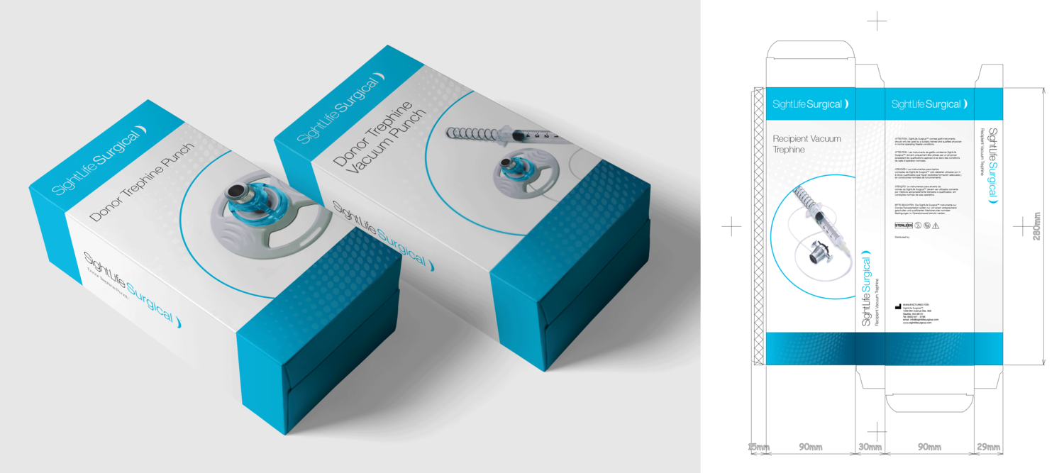
Product Package Design
With the launch of SightLife Surgical, their product packaging needed a visual redesign.

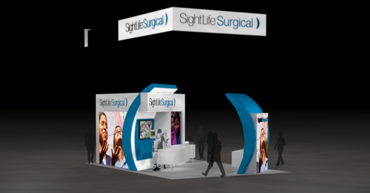
Trade Show Booth
SightLife Surgical is set to launch at AAO 2016 in Chicago, Illinois in late October. To help solidify their position as field leaders and innovators we wanted to create a booth that was eye-catching and like no other booth on the floor. The booth had to be flexible in usage spaces, have a variety of options for brand storytelling and be open to accommodate multiple traffic flows and user scenarios.