
PACIFIC LUTHERAN UNIVERSITY
Unconventional
A bold, unique brand refresh and recruitment campaign for a private PNW university that seeks to educate students for lives of thoughtful inquiry, service, leadership, and care—for others, for their communities, and for the Earth.

Project Deliverables:
Logomark refresh
Campaign style guide + illustration/iconography library
Recruitment campaign assets including OOH, Print, Social
My Role:
Senior Art Director, Design Lead
Brief:
We were tasked with updating the existing PLU visual identity elements with two concept-level design options that included considerations for an expanded color palette, typography refresh, iconography, and use of imagery. Updates from the chosen directions would be reflected in the larger comprehensive university brand guide, governing the use of all branded elements, including brand voice and key messasges.
Creative Strategy:
We wanted to highlight PLU’s tradition of excellence and the unique community aspect students and alumni contribute from their time as students and beyond. We found the insight of student individuality layered and woven together created a grand tapestry of the overall PLU brand.
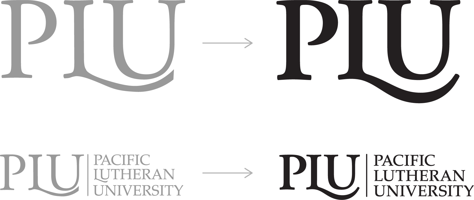
Logo Refresh:
Redesigned by Serrin Ransom

Campaign Manifesto:
At Pacific Lutheran University, we’re more than a campus full of individuals pursing our dreams. We’re a community of seekers, trailblazers, and reformers who see the potential of our collective, unrelenting care for others. Because the challenges ahead of us are complex and leave little room for the unadventurous and single-minded.
Together, we are the doers who investigate, create, and push boundaries with each other, for others. The ones who choose the unexpected paths. Never stopping to search for new opportunities that turn ambition into purpose. So, when you’re ready to discover the bigger picture—join the unconventional at Pacific Lutheran University and find what drives you to be the good by doing good.

Campaign Visual Strategy:
To represent the PLU student body, mission, and ‘unconventional’ messaging and nod to it’s Norwegian heritage, we created a bold, adventurous tapestry-inspired graphic design system. These individual shapes and patterns represent the unique perspective of all the students, but woven together represent the community and the larger picture of a shared good. A play between the bold geometric foundational elements and the hand-sketched pieces further weaves ‘unconventional’ into the tapestry.


Campaign Iconography:
The bold graphic shapes and hand-drawn sketches from the campaign tapestry could also be reconfigured and used in infinite iterations to represent key messaging, values, student life, clubs, sports, academics, and more.


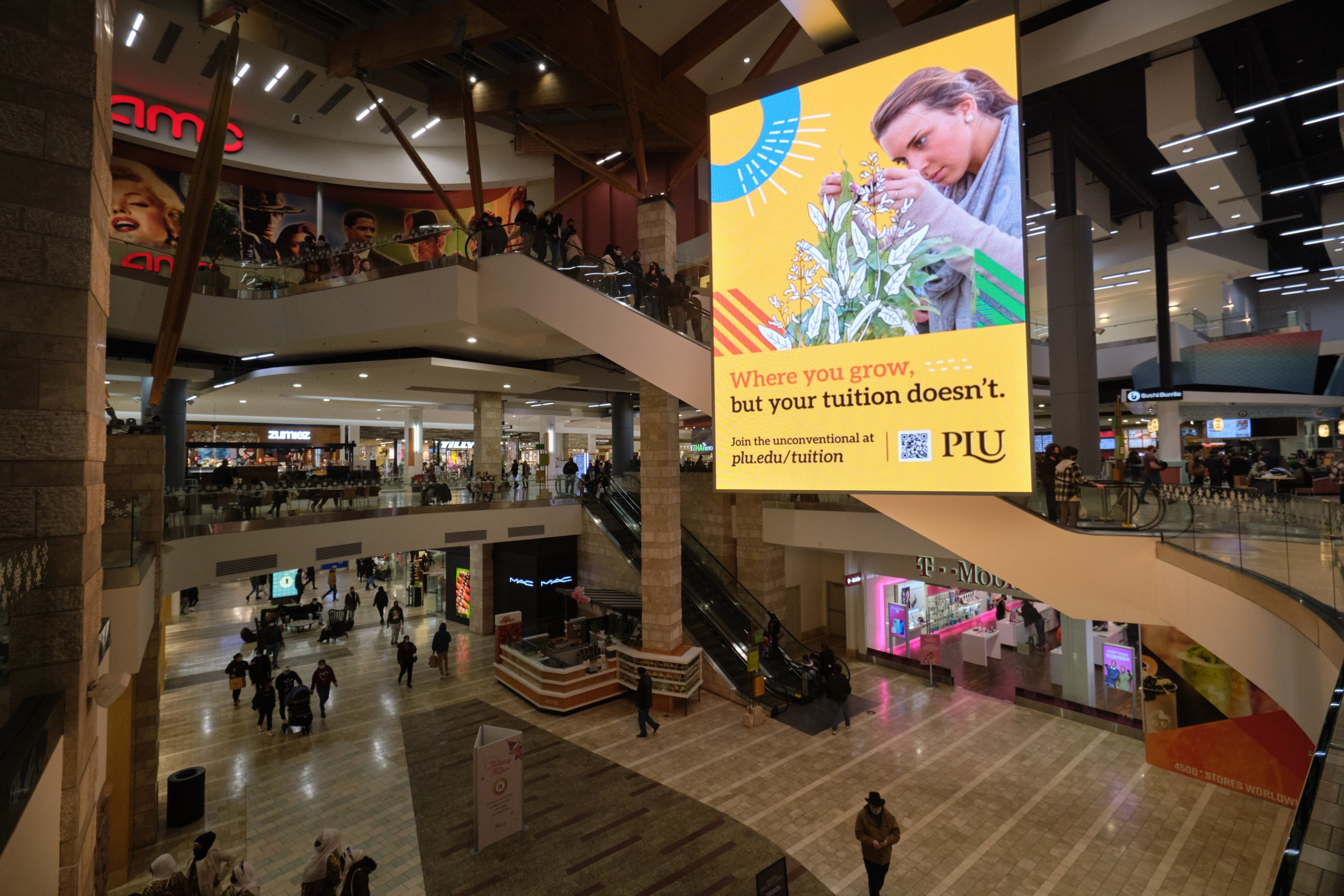
Campaign OOH:
Billboards, bus shelters and other OOH signage around the PNW airports and area malls, aimed to bring the ‘unconventional’ message to prospective PLU students.

Campaign Print Ads:
The tapestry created a dynamic single or spread layout for updating recruitment materials in local print newspapers and area magazines, targeting prospective high school juniors and seniors preparing just starting their search for college options.

Campaign Social:
The was also built to translate to social media, where the tapestry elements could be used to highlight messages for current and prospective students.

Recruitment Admissions Booths:
Considerations were also made for the visual representation of PLU at high school recruitment events and career fairs.


Team Credits:
Not many great things are accomplished solo. Here are the other creative team members that made this project a success:
Jessica Selander, SVP Creative Director, GMMB
Lacey Gonzalez, Senior CW, GMMB
Serrin Ransom, Design Director (Logo Refresh), GMMB